Friday 27 November 2015

Mens Outerwear A/W 2015/16 Trend Project - Street Style

This week saw my group searching the streets of Nottingham for individuals who were dressed in our chosen trends to photograph. We then presented our images during yesterdays seminar and discussed how we felt the trends had been translated onto the streets compared to what we had found in our initial research task and retail task. Just to remind you, the mens outerwear trends my group are looking into are as follows.

Styles - Bomber Jacket, Duster Coat, Parka

Colours - Camel, Black 

Materials - Fur, Quilting

The street style task within this project was the activity I had been looking forward to the most and it definitely lived up to my expectations. My group got off to a slightly rocky start as we had underestimated how difficult it was to catch the attention of those we wished to photograph, but once we got going we had much more confidence!

Below are my two favourite images from the street style task, which interestingly were the first two images I took. This particular example of outerwear fell into our 'Fur' category. This guy was so comfortable and relaxed with being photographed, which I feel contributed to the success of these images, as they are not at all awkward or forced. My group soon found that the images we took of those who were slightly uncomfortable with being photographed, were the least successful.
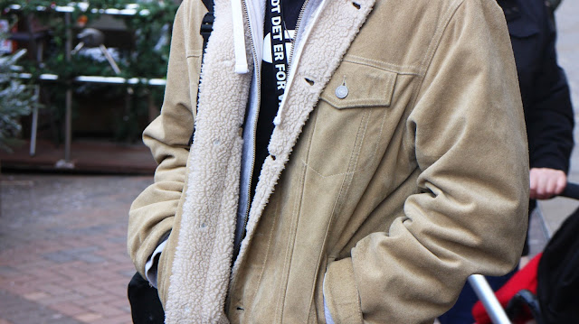
If only I had a pound for every time I heard 'Does this mean I'm fashionable then?'... 
After having spent a few days on the streets of central Nottingham searching for our chosen outerwear trends and taking photographs of those sporting these trends, my group and I began to create the presentation we presented to the rest our seminar group and a couple of our lecturers yesterday. As we looked back through the images we had taken throughout the beginning of this week, it became clear which of our chosen trends had filtered down and been adopted by the consumer and which trends people hadn't taken to so well. Our street style task supported some of our initial predictions but also went against some. We found that the duster coat was not as popular as we originally anticipated. However I came to the conclusion that this particular coat is likely to be a popular choice of outerwear amongst business men, who would obviously be at work on a Monday and Tuesday rather than out on Nottingham's High Street, which could explain why we saw just one example of the duster coat. My group were surprised at the lack of camel coloured outerwear we came across during the street style task. During last weeks retail analysis task, we saw a huge amount of camel coloured outerwear, so clearly this is a colour trend that isn't translating so well from retail to consumer.

My group and I found it really interesting at how the different areas we visited in Nottingham affected the trends we came across. For example when visiting the Hockley area of Nottingham, we saw many sporting the the bomber jacket and the one duster coat we came across we photographed just off of Bridlesmith Gate, where many of Nottingham's higher end stores are located.

I really enjoyed this street style task so hopefully street style photography will be something I have the opportunity to do again! If street style is something that interests you, I recently watched a really inspiring and insightful film which may be of interest based on the professional life of Bill Cunningham, a street style photographer from New York, I will link the trailer below.

Bill Cunningham New York Trailer: https://www.youtube.com/watch?v=NYqiLJBXbss

Love, Isabella x

Photo Credits: All Own Images
SHARE:

Thursday 26 November 2015

Factors Of Identity - Kurt Geiger

Following on from my last blog post 'Factors Of Identity - Tiffany & Co.' I thought I would select a brand, which wasn't touched upon within the 'Factors Of Identity' lecture last week to look into regarding factors of identity. I decided to focus on another of my favourite brands, the lovely Kurt Geiger. Okay so I may be a little biased towards the company as I work for Kurt Geiger myself, but I thought that I could use some of the knowledge I have learnt from working within the business to understand the brands factors of identity that little bit better.

Kurt Geiger doesn't have a logo as such, but similar to Tiffany & Co., the brand name currently takes on the role of a logo. The name stands as an umbrella brand for each of the individual brands within the company such as Miss KG, Carvela and Kurt Geiger London. The fact that Kurt Geiger doesn't have a logo could possibly be down to the fact that one logo wouldn't be appropriate for each of the individual brands within the company. For example a logo which would be suitable for Miss KG, the most affordable brand within the company which is directed at a slightly younger target market would not be fitting for Kurt Geiger London, the company's highest end brand which is directed at a much more affluent and subsequently older target market. Although the company does't have a logo, they do have a slogan, a factor of identity many brands tend to lack. The slogan 'Anything but the dress', is a term I feel is suitably fitting for the company as it addresses the fact that Kurt Geiger is an accessory brand.

Bright red is Kurt Geiger's key colour which is evident in each of their stores, their website and their packaging. This shade of red has positive connotations such as love, passion and desire but also negative connotations such as danger and anger. However these negative connotations could actually refer to less severe ideas such as strength and power, attributes a woman may feel when trying on a new pair of stilettos perhaps.
I must admit I have a slight obsession with Kurt Geiger's gorgeous glossy carrier bags, I thought that the novelty would wear off when I started  working for the company but 6 months down the line I can confirm, it hasn't. They are always so perfect the red ribbon neatly securing your purchase, suggesting luxury and exclusivity. I soon found out after joining the company that there is a very specific way of creating that KG bow!
In 2009, Kurt Geiger introduced the stiletto as a brand signature style. The stiletto, undoubtably a product which is a true reflection of the brand itself connoting glamour, sex appeal, power and elegance has been the brands key style ever since. Kurt Geiger even have a video on their website which follows the creation of their famous Britton stiletto (I will link below). The Britton shoe, which is priced on average at around £200 takes centre stage within many Kurt Geiger stores within their signature shoe chandelier (I will link a shoe chandelier video below also). Right is an illustration of a pair of Britton stilettos by Jackie Bisset.


The Geographical reference for Kurt Geiger is London, where the Company's headquarters are located. The business originally opened its doors in 1963 on Bond Street, hence why one of the brands most popular, famous stilettos is named 'bond'. The Kurt Geiger website often refers back to its geographical reference, Englands capital. The website reads 'Kurt Geiger has set itself apart with fashion authority blending London style and urban wearability.' and 'London styling is at the heart of the Kurt Geiger brand.' Some may even argue that the the brands Geographical reference is carried throughout each aspect of the brand through the use of its key colour key colour, red. Red is a colour I feel has strong links with the City of London. The Kurt Geiger red is similar to that of the red found within the British flag, postboxes, telephone boxes and buses.

Kurt Geiger's cultural reference is the face of the brand herself, the gorgeous, Lara Stone. The British models edgy, individual look partners her perfectly with the brand. The Autumn/Winter 2015 campaign she recently starred in saw her pose for several shots one dressed in nothing but bags another wearing velvet thigh high boots and another wearing stockings and a suspender belt. 'It's about strength and sensuality, and being comfortable in your own skin' explains Rebecca Farrar-Hockley (Kurt Geiger's Creative Director) regarding the campaign video, which was created to evoke 'power and strength'. I love Lara Stone and think she is a fabulous representation of the brand, something tells me I'm not the only one, as this is the second time she has been cast to star in a Kurt Geiger campaign! The A/W 2015 campaign video which I have posted below is worth a watch, isn't she fab?


Overall I think that Kurt Geiger have built up a strong brand identity, however a factor of identity which Kurt Geiger lack is a pattern. Similar to Tiffany & Co., Kurt Geiger is a relatively sleek, smart brand and I feel a pattern would not effectively reflect these qualities. The simplistic use of the red tone is sufficient in creating a significant brand image for Kurt Geiger, therefore in my opinion a pattern is unnecessary.

'Made in Italy' Britton stiletto journey:  http://www.kurtgeiger.com/be-inspired/made-in-italy Signature 'shoe chandelier' video: http://www.kurtgeiger.com/be-inspired/shoe-chandelier

Love, Isabella x

Photo Credits: Google images, anythingbutthedress.com, Pinterest 
SHARE:

Wednesday 25 November 2015

Factors Of Identity - Tiffany & Co.

Last week, Tuesdays lecture focused on factors of identity within brands. This basically involves everything that makes a brand what it is, what it stands for and what makes it memorable and recognisable. Certain brands build up an identity really well, others not so well. Factors which a brand may use to make up an identity include a logo/crest, colour/tone, pattern/motif, a key product, a gesture/message and geographical and cultural references. Within the lecture, we looked at how a range of brands including Tiffany & Co., Liberty, Burberry and Hermes have chosen to use these aspects to build up their brand identity.

Tiffany & Co. has to be one of my favourite brands which is made quite evident looking at my christmas list! The brand is incredibly recognisable, I would even say one of the most recognisable brands out there, so it was really interesting to have an insight into just what makes it so identifiable. To begin with I think the name   of the brand, particularly the use of the word 'Co' really influences its reputation of status, exclusivity, prestige and luxury which gives the consumer a desire to own.

It's utterly undoubtable that Tiffany own that particular shade of blue. This turquoise blue has become so representative of the brand that it is even often referred to as 'Tiffany blue' (I'm definitely guilty of doing this). You only have to see something in this blue tone to immediately think of the luxurious jewellery brand. This colour is so cool, crisp, classic and luxurious which is really reflective of the brands products and the brand itself.

'The best presents come in a small blue box'. So girls, who doesn't have a collection of these gorgeous boxes on their dressing table? This packaging has become so recognisable that it doesn't have to have the brand name displayed anywhere on it but you just know what you'll find inside, because the box has become signature of the brand.

Tiffany's key product the ring, to me is a true reflection of the glamour, heritage and sophistication associated with this admired brand. This product has such strong links with romance, desire and taste which are all true concepts to Tiffany & Co. as a brand.

New York is the Geographical reference for Tiffany and Co., its flagship store (right) is located here. The store, based on the corner of Fifth Avenue and 57th Street was opened in 1940 on October 21st. I've never been to this store but it just looks truly magical! I can't wait to make a visit when I travel to NYC in January and treat myself to something from my Tiffany wish list! Regarding its flagship store on 5th Avenue a quote on Tiffany's website reads 'It is simply the most famous store there is. Every cab driver, every New Yorker, every visitor knows where to find Tiffany & Co. This is the marvellous place where dreams come true'. The links the brand has with New York gives it this essence of glamour and style we associate with Tiffany & Co..

Tiffany's cultural reference is the stunning Breakfast At Tiffany's star Audrey Hepburn. The image of Hepburn on the right just shouts Tiffany's, from the elegant, glamorous lady herself, to the statement jewels and the blue background. The image portrays the true confidence, exclusivity and sophistication of the brand.

Taking into account all of these factors which together make up the identity of Tiffany and Co, I think the company has done a really great job at defining itself as a brand and I would definitely say it has to be one of the most well identified brands, if not the best of all. Out of all of the aspects we looked at in the lecture which make up a brands identity, Tiffany and Co. only lacked one, and that was pattern/motif. I have to say I think this is intended, the simple, timeless and classic blue and white box is used to reflect the sophistication of the brand and this is all that is needed. I think a pattern would not at all work effectively with this brand as it would be too fussy which I think would lead to Tiffany & Co. maybe losing some of this well earned brand identity and also the luxury of it, as it is known for being smart, and simple rather than over elaborate. I also believe that a motif would be unnecessary for Tiffany's also, the name 'Tiffany & Co.' and the typography of this is recognisable and in my opinion the simplicity of this adds to the luxurious feel of the brand.

Below is Tiffany's most recent ad 'A Tiffany Holiday'. The Christmas advertisement oozes all the brand stands for and a number of factors which contribute towards this brands identity are captured within this ad, from the setting of New York to the use of the brands statement colour, which together create the feel of romance, sophistication and glamour. I really like how the identity of Tiffany's is made so clear within this ad, giving the same sense of luxury and desire you would expect if you were to visit a Tiffany and Co. store itself.


Hopefully this post may have explained a little bit more about why we see that shade of blue or that pretty packaging and immediately think 'Tiffany & Co.'.

Love, Isabella x 

Photo Credits: Google images, Tiffany.com, Youtube
SHARE:

Monday 23 November 2015

Brand Narrative - High End VS High Street final

In todays seminar we were discussing market level translation. We looked at the interpretation of key fashion attitudes and brand values at both high end and high street levels and how the same story is portrayed at the different market levels. There is such a wide range of narrative stories such as traditional heritage, humour and irony, glamorous excess, wit, and so on. Fashion tells these same stories with similar style narratives and aspirations using the repetitive codes, connoting and denoting the same messages whether it be at a high end or high street level.


We began the seminar by comparing the two editorials above, the left by Paul Smith and the right by Ted Baker. These editorials have a the same narrative story of 'Brit heritage'. When highlighting the features which were evident in both, we noticed that both include a female and male model, both are based in a woodland setting, both models within both editorials are looking straight into the camera, both male models are wearing suits and have facial hair, both female models are wearing dresses, and both images have a similar ratio of ground to sky. Although these editorials are very similar in a number of ways, there are a few aspects which suggest the market levels and brand values of these individual labels. For example the barbed wire which features in the Paul Smith editorial reflects the rugged, British country aspect of the brands image and within the Ted Baker editorial the styling of the male models jacket, as it is neatly done up, reflects the smart, clean cut attributes of Ted Baker as a brand.

The similarity of the above editorials is actually cringeworthy. These editorials, the left by Polo and the right by Gant, have a strong 'preppy privilege' narrative. When discussing the factors evident in both editorials which contribute to this 'preppy privilege' narrative we began to understand why these editorials are so similar. We noticed that in both clear affection and intimacy is displayed, as the models are clearly acting as couples with their arms placed lovingly around each other. The nautical colour palette and WASP east coast styling is present throughout both editorials, both are set in a leisure sports environment, there is euro lifestyle referencing and of course the stripe overload is prominent within both editorials... However although these editorials have such strong similarities, in each there are distinctions which portray the brands individual values. For example the Polo editorial has a very 'cheesy' feel to it, as a toothy smile is seen on the faces of all four models and the editorial feels slightly staged and possibly a little insincere. On the contrary the models in the Gant editorial have a happy, yet much more subtle, sexy and seductive facial expression. The sunglasses worn by the male model also adds to this sexy, cool, sultry, less cringe feel. 


As a short task we were then asked compare some high street brands and high end brands with similar fashion attitudes and brand values, we were give editorials as a staring point and we were asked to think of a narrative title to suit the brands. I chose to compare the editorials displayed above, the left by high end brand Chloé and the right high street brand Jigsaw. I decided to put together a list of words before coming up with a narrative title to suit these particular brands using these editorials as a focus. Words which I felt reflected both of these brands included, fairytale, angelic, enchanted, innocent and romance. Although these images have an enchanted angelic feel to them due to the woodland setting, soft pink and nude colour palettes and the flowing hair and dresses I feel that the images hold strong stories behind them. In the Chloé example I feel as though the models are running from danger and in the Jigsaw editorial I feel as though the model is waiting for something to happen and the relatively stern facial expression suggests something maybe worrying or threatening. so I came up with the title 'Enchanted Fairytale'. The word 'Enchanted' is used to represent the innocence and purity of the narrative and 'Fairytale' illustrates the drama and the theatrics of the narrative.

I love these above editorials, the left by Roberto Cavalli and right by River Island. Firstly I searched for similarities which are present throughout both of these editorials. I observed that a bright, vibrant colour palette is carried through both, there is a large focus on clashing and dominating patterns and the female models are stereotypically 'female' (attractive, girly, glamorous dressed in pink and wearing high heels). Something which really stood out to me when examining these editorials for sameness, was that the female models are very dominant and seem to be the focus. The male models are gazing at them whilst they look elsewhere suggesting that these editorials have a particular focus on the power and independence of women. Again I listed the words which instantly came to my mind when studying these images. I was left with words such as, Barbie, brights, holiday, playful and fun. So I came to the conclusion that I would name this narrative 'The Holiday Plastics'. I think this title is reflective of these editorials as it incorporates the holiday theme which is so prominent within both editorials due to the sunglasses, sun hats, bikinis etc which feature, but through the use of the word 'Plastics' which refers to a barbie doll, the barbie, pink, glamorous feminine essence of the editorial is also captured.

Its really interesting when you start to think about how some brand values and narratives are mirrored from high end to high street and how this is done!

Love Isabella, x

Photo Credits: Brand Narrative seminar presentation 

SHARE:

Friday 20 November 2015

Burberry - 15 Years Of Billie Elliott

The festive season is great in so many ways, one being the glorious Christmas ads! I have just watched Burberry's seasonal advertisement and it is truly delightful. The ad made its debut at an event at its Regent Street store in London. The campaign was created as a homage to the film, 'Billy Elliott' to mark 15 years since it was originally released, the opening scene of the classic film was recreated within the ad.

What I particularly love about this advertisement is the way it oozes fun! It's easy for luxury brands to create a stern, serious, sultry feel to their ads to give that sense of prestige, so it's really endearing to see Burberry produce such a bubbly and cheerful ad.

The ad has a strong focus on famous faces, jam packed with celebrities. Those who feature include, Sir Elton John, George Ezra, James Bay, James Corden, Naomi Campbell, Michelle Dockery, Rosie Huntington-Whitley, Julie Walters and of course the face of Burberrys festive advertisement for the second year running, the adorable Romeo Beckham. At the end of the advertisement the names of those who appear within the ad are credited, displayed in a format similar to subtitles at the end of the film giving the ad a film like feel, linking it back to the Billie Elliott theme. By stating the names of those who feature within the ad, suggests that Burberry are aiming to make clear to watchers the status of those wearing their products within this ad, most likely in the hope that this will influence purchases.

The ad includes such a range of characters, its not surprising to see the likes of models, Rosie Huntington-Whitely, Naomi Campell and Romeo Beckham star in a Burberry ad however James Cordon, Sir Elton John and Julie Walters, lets face it aren't amongst those we are used to coming across when flicking through our monthly issue of Vogue. I think that the casting of those who aren't professional models is an aspect which has contributed to this ad having such a light hearted feel. Having characters who don't have a professional modelling background, feature within this ad allowed it to seem incredibly natural and relaxed which therefore gives a feeling of genuineness. By being brave enough to not just cast drop dead supermodels within their ad, Burberry have the ability to reach out to certain consumers. For example a woman in her mid 60's may be put off by a product having seen it modelled by a stunning young model, branding themselves as too 'old' or 'fat' for the product. However seeing the same product worn by Julie Walters may alter this point of view.

Many effective ads, particularly those released during the festive period tend to aim to work around the idea of selling a story or lifestyle to consumers rather than the product/s they have to offer. Instead, Burberry have chosen to go down the product based route, ensuring that a wide range of products are presented within this advertisement, however I feel it is still really effective. This could possibly be due to the fact that there is no dialogue or text in the ad, just music (T Rex - Cosmic Dancer) so the watcher can enjoy the clip without products being noticeably pushed and forced at them, this technique is much more subtle and in my opinion effective.

Another aspect of the ad I think that contributes to its essence of joy is its focus on dance and movement. Obviously this is a Billy Elliott tribute so the theme of dance and movement is particularly relevant. The garments which feature within the ad are really complimented by the movement created through the use of the trampoline. The movement is played in slow motion which allows the fringing of the scarves, tassels of the boots, shapes of the coats and even the models' hair to be captured really effectively in a captivating, gripping manner, which I think portrays a magical, Christmassy effect.

Its the classic cashmere scarf in check and hearts, worn by Rosie Huntington Whiteley I have my eye on! I have posted the advertisement below for anyone who is yet to see it.


Love, Isabella x

Photo Credits: Google images, Burberry.com, Youtube 
SHARE:

Wednesday 18 November 2015

Menswear Outerwear AW15/16 Trend Project - Trend Analysis

Last week I was introduced to the new project I will take on over the next four weeks. My seminar group was divided up into groups of three and given a category which would be their focus throughout this project. Much to my disapproval my group was dealt the menswear category. There were so many categories such as beauty, footwear, denim and activewear which I felt would be so much easier, more interesting and overall would efficiently cater for my girly character in a way that menswear couldn't.

Anyway I bit my tongue and got on with it and found myself actually quite enjoying the challenge. We were asked to finalise a subcategory which would be our focus throughout the project, our initial instinct was to go with outerwear as this seemed like a broad category which had the potential to be really interesting. We also agreed that when it came to the street style task, in reality this category would be the best bet due to the season.

Our first task of the project was to gather as many images as possible of trends within our chosen subcategory. So individually my group went away over the weekend and collected images, we used sources such as WGSN, Pinterest, Vogue.com, and GQ magazine to locate these. 

We then came together to produce a visual mood board using our findings. From just a glance, it was made clear from the mood board what the dominant mens outerwear trends for this season are. Trends we came across when categorising our research include tweed, camel, duster coats, bomber jackets, leather jackets and fur detailing.

Visual Mood board 
Within the mood board we categorised the images we had found into trends, based on style, colour and material. We were then asked to name the trend categories we had come across, for example we named our tweed trend category 'Old School Librarian'. Lastly we  had to decide on the final trends we would focus on within our project. We chose the trends we felt were the most prominent within our mood boards. 

Styles - Bomber Jacket, Duster Coat, Parka

Colours - Camel, Black 

Materials - Fur, Quilting

Over the next few weeks I plan on keeping my blog updated with each step of this project so keep your eyes peeled!

Love, Isabella x 
Photo Credits: All Own Images 
SHARE:

Monday 16 November 2015

Victoria's Secret Fashion Show - 2015

Without a doubt this is the fashion show I look forward to the most each year, everything about it is always so captivating, theatrical and stunning, never failing to deliver great quality entertainment. I really like how the brand has such a clear image and each year the show is always so reflective of this. For me nothing can top the glitz, glamour and sparkle that is the Victoria's Secret fashion show! Hosted at the Lexington Avenue Armory in New York City last Tuesday evening, this year marked the 20th anniversary of the annual show and it was as extraordinary as ever.


Popular, well known musicians have always featured within Victoria's Secret fashion shows, in past years the likes of Justin Bieber, Ariana Grande and Taylor Swift have taken to the VS runway and performed amongst the angels. This year was no different, with appearances from Selena Gomez, The Weekend and Ellie Goulding. Goulding stood in Rhianna's place after the singer dropped out of the show a week earlier. Having big names of the moment perform on the catwalk is a great way for Victoria's Secret to gain publicity for its shows and the brand itself. Gomez, Goulding and The Weekend have a total of 61.8 million Instagram followers and 43.4 million Twitter followers between them. Each of the artists posted on both of these social media sites regarding the show, prior to it taking place or after. This meant that an incredibly wide audience was made aware of this years show through these artists posting about it on social media alone. Gomez posted a total of 5 images related to the show on her Instagram page, two of these images reached 1.7 million likes. Goulding made 7 posts regarding the show on her Instagram page, she also reposted a VS show related image onto her page, one of her posts reached 272K likes. The weekend posted a photo on his Instagram account of himself amongst the angels, accompanied by Selena Gomez which gained 274K likes.

A week before the show was due to take place, On Tuesday 3rd November Kendall Jenner and Gigi Hadid took to Instagram and Twitter to post an illustration that had been drawn of the pair labelled 'Victoria's Secret Service'. The models captioned the posts gushing how they were the 'newest recruits' to join the team of angels. I think that casting the young models as angels for this years show was a smart move for Victoria's Secret. Jenner and Hadid's careers have rocketed over the past year with them taking on major jobs. Jenner has previously taken on the role as the face of beauty brand, Estée Lauder and Hadid, the face of the Autumn/Winter campaign for high street brand Topshop. The best friends have such a great following and it seems as though they come as a pair. They are often seen together personally and professionally, they have recently starred alongside one another in the H&M X Balmain campaign. I think casting the girls together will prove to be a particularly intelligent decision for Victoria's Secret as they are both hot property in the modelling world right now, so it makes sense to have them work alongside one another.

The Kardashian/Jenner clan took to their Instagram and Twitter accounts to express their pride for second to youngest sister, Kendall. To the left are some of the images the family, including Kendall Jenner herself (41.3 million followers), Kylie Jenner (42.2 million), Khloe Kardashian (35.7million), Kim Kardashian (51.7 million), Kourtney Kardashian (28.6 million), Kris Jenner (9.3 million) and Caitlyn Jenner (5 million) posted on Instagram. In total this ultra famous family have an Instagram following of a whopping 213.8 million! As you can see the images racked up millions of likes, with one of the pictures posted by Kendall herself, reaching an astounding 1.7 million likes. It wasn't just the Jenner/Kardashian family who took to Instagram to document the event. Gigi Hadid posted 8 images onto her Instagram account (8.5 million followers) her most popular post coming in with 893K likes. Like Jenner, Hadid also received support from family through Instagram with her brother, Anwar Hadid posting 3 images onto his Instagram account regrading the show along with their mother Yolanda Hadid Foster who made a total of 4 posts regarding the event.

The show was also covered on social media platform Snapchat. As you can see from some of the imagery I have displayed within this post, the whole show has a certain feel to it and this doesn't stop backstage. The hair, make up and general girlie hanging out backstage adds to the ethos of this show. Through the use of snapchat, fans of the brand had the opportunity to see what went on behind the scenes, which is really just as interesting as the show itself! Seeing the models dressed in the brands statement stripey pink robes being beautified is all part of of the event.

I'm counting down, along with the Victoria's Secret website and I'm sure many of you for the show to be aired on television on 8th December. These images have got me a whole lot more exited to visit New York in January, where I'm sure I will spend far to much time in the Victoria's secret store.

Love, Isabella x

Photo Credits: Instagram, Twitter, Google images 
SHARE:

Wednesday 11 November 2015

Paul Smith - Gentleman Designer


During film club this week, I watched a film based around the professional life of Sir Paul Smith 'Paul Smith - Gentleman Designer'. Smith is originally from Nottingham, where I am currently at university so it was particularly interesting for me to broaden my knowledge of the brand and Paul Smith as a person. Its not surprising that the Paul Smith flagship store is located in Nottingham, in a building named 'Willoughby House'. This isn't the only Paul Smith shop within Nottingham, the company's first ever store which is located just around the corner from Willoughby House, remains but now as a 'PS Paul Smith' store which is considerably smaller than than the flagship store and only stocks menswear.

I thought that the film captured Smiths personality really well and it allowed us to have a real insight into his character, and he seems like such a lovely man! He came across really hard working and mentioned in the film that he usually leaves his house at 6 o'clock every morning. Although he comes across really dedicated to his career and work life it seems he has a great sense of humour too. Moments within the film made it clear that Smith doesn't take life to seriously. The designers office featured in the film, a cluttered room packed with inspiration and  items of nostalgia he has collected from around the world or has been sent over the years. During the film Smith reached behind his office door he referred to as his 'filing cabinet' and pulled out a newspaper he opened the newspaper to reveal an array of small paper notes he had collected, each note with a different positive or inspiring quote. This struck me as such a sweet idea, lets face it there are times we could do with a positive or inspiring quote or two when we're in the office!

Paul Smith has become a global brand, wholesale to 66 countries around the world in total, 17 of these stores are located in England. Paul Smith stores can also be found in New York, San Francisco, Los Angeles, Korea, Singapore and Anterwep, but the country home to the largest percent of Smith stores is Japan with over 200 located here!
The number of Paul Smith stores located in Japan compared with the number in England, where the brand originates from it is actually quite fascinating and shows just how big the fashion market is in Japan. Within the film we followed the man behind the brand on a trip to Tokyo, I was quite surprised at how similar the Japan Paul Smith stores are to the English ones. The Japan based stores have the same style as that of the English stores, a very clearly English look. The strong links with the English heritage could explain the popularity of the brand in Japan as the stores have an individual look which particularly stands out when taken out of England itself. Not only did the film show just how popular the brand is over in Japan but also Smith himself, he is viewed as a star there and is treated as a big celebrity. He explains when he visits the country during business he attends between 20 and 30 interviews per trip.

Collecting inspiration and information from aspects for fashion from outside of fashion is a big part of my Fashion Communication and Promotion course, so it was inspiring for me to see how Smith collects inspiration ideas for his designs. Clearly this creative process is something Smith feels is important also enjoys, he sees inspiration everywhere and he feels so strongly about this that he even wrote a book regarding the idea 'You can fine inspiration in everything and if you can't look again'. Although the ideas I collect will not inspire fashion designs but instead other creative aspects such as styling, art direction or a colour palette, I still go through this same research process. A lot of Paul Smiths designs are influenced by musicians/bands and fairgrounds, in the film we saw him visiting a fairground photographing everything that caught his eye from patterns to colours. I noticed that Smith takes great pleasure from being behind the camera, snapping everywhere he goes. We even saw him getting involved and taking part in the photography for campaigns and lookbooks for his collection during the film. He explained that he likes to capture a mood rather than the detail of clothes within his brands photography. We saw Smith travel to Portobello Road, London within the film where he searched the rails for vintage clothing which caught his eye. Garments he particularly took a fancy to, or saw something unique in, he purchased and took back to his design team to use as inspiration. He made a point that he doesn't copy designs he likes but may just take inspiration from an aspect he liked about the garment for example, the pattern, colour of a print or the way a sleeve has been put in. I thought this was a strong point as my work within FCP will also require me to use this thought process of putting my finger on what I specifically like about something using this to inspire me rather than just copy what has already been done.

As I watched the film I tried to bear in mind what makes this brand so popular and by the end of the film I had come to a clear conclusion. Paul Smith is individual and not one of these 'try hard' brands we see so many of. Smith even touched on this point himself within the film, he explained that he sometimes thinks the brand should focus on being more fashionable and trendy but he then realises that this individuality is it what makes his brand successful, as it makes it wearable for such a wide audience.

Hopefully having read this you have a little more knowledge about Paul Smith, the man and the brand.
Love, Isabella x 
Photo Credits: Google images


SHARE:

Tuesday 10 November 2015

H&M X Balmain Collaboration

Last Thursday, the morning of bonfire night the H&M X Balmain collaboration made its debut and boy were there fireworks! We had been waiting on tender hooks for this day since the collaboration was first announced in May, and it seems everyone and their Grandma has gone crazy for it. The Parisian label Balmain, worn by the likes of the Kardashians, Kylie and Kendall Jenner and models Gigi Hadid and Jourdan Dunn has flourished over recent years. The fashion house's strong links with celebrity statuses have really influenced its growth and popularity. Creative Director of Balmain, 29 year old Olivier Rousteing is a big user of social media sites including Twitter and Instagram and has  used this to his advantage throughout this campaign. The hashtag '#HMBALMAINATION' was used to promote the collection across both Twitter and Instagram with a host of celebrities using this hashtag on their Instagram posts during the run up to the release, including Jourdan Dunn (1.4 million followers), Kendall Jenner (40.9 million followers) and of course the man himself, Olivier Rousteing (1.7 million followers). This huge social media backing and the fashion house's association with big names, particularly stars of the campaign, Kendall Jenner and Gigi Hadid, who's joint Instagram following equates just under 50 million, were what I  believed triggered the chaos we saw within H&M stores across the globe, from New York to Paris and London to Italy. 


There was, shoving, snatching and scuffling
across H&M stores on Thursday, with those of the 'Balmain Army' queuing for up to 3 days in certain parts of the world to try and get their hands on some of this affordable designer gear. London's Regent Street store even saw queues wrapping around the building. Olivier Rousteing has always connected with fans through social media, and this campaign was no different, it was built up over a series of months which is why I feel that this collection whipped up such a frenzy. However due to a large amount of customers left feeling disappointed to not have nabbed an item of the collection, social media is where they flocked to express their feelings. Many took to Rousteing's accounts tweeting and commenting their anger regarding the issue. Some moaned of their disappointment due to the lack of stock, others lashed out about how they felt it was unfair that many people were buying as much as they could get hold of, just to sell on eBay at an expanded price and others complained about the breakdown of the website. I understand that this has been a long awaited collection for many, however I do think that many of these issues that people have chosen to raise with Oliver Rousteing through his social media accounts are actually out of his control. For example he does not run the website or have any say in what people do with the garments once they have purchased them, so I think its rather unfair that he is being personally targeted and blamed for certain problems which occurred during the debut of the collaboration.

The collection flew in and out of H&M stores worldwide within hours and in some cases even minuites and the website crashed almost straight away, when consumers flocked to their laptops for the release at 8am. For many disappointed shoppers when the website issue was resolved and they were redirected to the page practically all products were sold out. These complications meant that there was an accumulation of irate customers who didn't manage to purchase anything from the collection. For those who have missed out, theres still the chance to grab some of the H&M X Balmain goods.. at a price. Lucky shoppers began listing the products they had managed to salvage from the riots almost immediately on eBay, and they're not cheap. Some sellers have even been asking for 4 times what they initially paid for the garment. Not only did shoppers of the regent street store take to the internet to sell goods for an inflated price, but alledagldy also the streets! People were seen handing over cash for the goods they wanted from this extraordinarily popular collaboration.


I think that there were flaws within this collaboration, the marketing and promotional side of it was far too strong and effective, particularly the social media aspect to handle the lack of stock and strength of the website. Those who took to their laptops to grab the must have buys were met with a page on H&M's website stating 'We have a lot of visitors on the site right now. This is due to the high level of interest in our latest collection'. Many shoppers who visited stores for the debut of the collection were left feeling disappointed not to have managed a purchase, even some who queued for hours on end. Not only do I believe that extra precautions and planning should have taken place to prevent the website from crashing but also that the company could have been better prepared for the amount of stock they would require in stores to avoid letting customers down. Many shoppers took to the streets and internet to sell the garments at a marked up price. H&M cannot directly dissolve this problem as it is obviously the buyers choice what they do with their purchases, however if stock wasn't so limited this problem would be helped as less people would have to buy off of eBay in the first place as they would have been able to purchase the goods from the store instead. This would benefit both H&M and Balmain as it would be the companies making the profit rather than those who mark the prices up on eBay. I think that H&M underestimated what the demand and reaction to this collection would be. Really the company only had to see how much of a following the collaboration had on social media sites, the promo video, posts and tweets and take into consideration the large amount of celebrities that had been seen wearing and promoting the garments. This way I feel they could have been much more prepared. I see the problem H&M are faced with, there is a fine line between pleasing customers through making the stock widely available and ensuring that the collection doesn't lose its exclusivity through mass production. However when the garments are being sold on eBay for incredibly marked up prices, I think the fun of the collaboration is taken away because the whole point behind it is that designer products are made affordable, otherwise we would just buy straight from Balmain surely? Disgruntled customers are not good news for H&M. The company tends to collaborate with designer brands on an annual basis, in the past they have joint forces with the likes of  karl Lagerfield, Alexander Wang and Jimmy Choo, however this particular collaboration has been the most popular and chaotic collaboration to date. Consumers will soon become disinterested in the collaborations if they seem to just cause mayhem and chaos, meaning future collaborations could prove to be less successful.


Head over to Ebay if you're still desperate to own something from the collection however, be prepared to pay the big bucks as prices now are more alike to that we see on Balmains price tags to what we see on H&M's. I mentioned the promo video for H&M X Balmain collection which I really liked so I have left the link below for those who aren't one of Kendall Jenners 40.9 million followers who may have missed it!


Love, Isabella x

Photo Credits: Google images, Marie Claire.co.uk


SHARE:

Sunday 8 November 2015

Steps - Visual Merchandising Trend Alert

Whilst wandering up and down Oxford Street on Sunday last week, I picked up on another visual merchandising idea I believe to be a trend, steps. Below are the images I took of a River Island window display. River Island have used steps on the backdrop of the window display with a mannequin sat on the bottom step and another set of steps facing forwards, where shoes and bags are displayed. I think that the steps have been used effectively to display the accessories. It is easy for accessories to get lost within window displays, in amongst mannequins etc but here the steps provide elevation for the products, they are lifted higher reaching peoples eye line rather than being on the floor or worn by the mannequin, where they are not quite as noticeable. 


It isn't just window displays that this vm technique is being used for, I noticed that steps had also been used within in store visual merchandising. The images below I took of H&M (left) and River Island (right). I really like how the steps have been used in both of these stores to create a visual merchandising feature along with numerous mannequins. I am particularly attracted to the River Island example as it gives a catwalk feel due to the positioning of the mannequins, they have been placed behind one another in a line form, the use of the lights also adds to this effect. The H&M example is also effective, I think that it is particularly powerful due to the duo colour palette. Only green and black garments are displayed on the mannequins located on the steps and therefore they successfully compliment each other meaning that the overall display flows really fluently. In a sense I think that as the mannequins are elevated by the steps it gives them, and therefore the garments worn a somewhat prestige feel, which may not have been achieved so effectively if the mannequins were simply placed on ground level.


I thought that Zara (below left) had used steps in an in interesting manner. In the other examples I came across during my research the steps are being fully utilised, with products and mannequins displayed on them however with the Zara window display, one mannequin was placed on one of the lower steps and the rest were left clear. Zara has built up a direct image with their visual merchandising, it always has the same sleek and simplistic feel and this display is reflective of this. Aldo was also amongst the stores using steps within visual merchandising on Oxford Street. The steps which featured within their window I found to be relatively simple and subtle, they have a cage effect which allows shoppers to not only see the window display, but also the rest of the shop as they are able to see through the steps. This is intelligent use of visual merchandising on Aldo's part as it gives the brand the chance to showcase their whole shop worth of products through their window display rather than just what is placed in the window.


So if you get a chance, keep an eye out for the use of steps within visual merchandising whilst you're getting through your Christmas shopping!

Love, Isabella x
Photo Credits: All own images
SHARE:

Saturday 7 November 2015

John Lewis - Man On The Moon

Now that all of the Christmas Ads have started to appear on our television screens, I have been patiently waiting for John Lewis' annual contribution. Every single year they seem to come up with something that is just as captivating, heart-warming and all in all as incredible as the last year. This years advertisement aired for the first time last night during the first ad break of Gogglebox on channel 4, and I'm sure it tugged at the nations heart strings as it did mine. Once again, John Lewis have not failed to amaze during the festive season.

The campaign 'man on the moon', features a six year old little girl, Orli who plays Lily and Jean, a French 77 year old, who plays the character of the 'man on the moon'. The fact that the ad is based around the moon is particularly significant, as this year on Christmas day at 11.11 GMT a full moon is scheduled to be glowing in the night sky. This is actually pretty special as this is the first time a full moon has occurred on Christmas day since 1977 and it won't be happening again for another 19 years. John Lewis have even released an app where users are able to follow the lunar calendar from now up until Christmas day.


The message behind this advertisement is what I think makes it so moving, it focuses on the loneliness of the elderly at Christmas time which I think is an overlooked topic, so I'm really pleased that such a well respected, established brand has touched on this issue to raise awareness and funds. The advertisement was made in concert with Age UK, and John Lewis will be supporting the charity through both online and in store activity, donations via text and even through sales of Christmas products throughout November and December. It is particularly touching to see John Lewis working closely alongside and supporting a charity, as the act of giving is an underlying topic which is carried through the company's Christmas advertisements every year so it is heart-warming to see John Lewis putting this idea of 'giving' into practice. The soundtrack which features in the advertisement was recorded by up and coming singer, Aurora Aksnes. The 19 year old covered 'Half The World Away' originally sang by Oasis. I feel that this song was perfectly selected to highlight the true underlying message of the advertisement. The idea of 'half the world away' representing the isolation and distance felt by the elderly at this time of year. I think that the symbolism of the moon holds such importance within the ad also because it is this aspect which really portrays the idea of isolation and loneliness as the moon as a location is very segregated and alone.


There is a clear pattern emerging within John Lewis' show stealer christmas ads. Each year the underlying story of the film is based around the idea of giving rather than receiving, The soundtrack is never a generic Christmas song but instead a cover of a well known song (which we all end up associating with christmas after it being used within the advertisement) and there is never any speaking involved. John Lewis' head of brand marketing, Rachael Swift explains that she didn't want to change this style that has become so traditional of the annual television advertisement 'It has become part of our handwriting as a brand. It's about storytelling through music and emotion. The sentiment behind that hasn't changed - and that is quite intentional. The strategy behind our campaigns is always about thoughtful gifting'. I think that they way John Lewis have built up this name for themselves through their annual Christmas television advertisement is really admirable, every year they have watchers spanning across the nation on tender hooks waiting for the ad to be aired and they never disappoint, this year being no different. The company manage to produce something innovative every festive season with the same foundation and ideas behind it but each year it is so different from the last. 

The advertisment was uploaded to Youtube at 9 o'clock on Friday morning, and the video had been viewed just under 2 million times and been tweeted about using the hashtag '#manonthemoon' by over 70,000 people all by 5 pm that evening. All this attention received by the advertisement was before the advert had even been aired on television, which it was during the first ad break of Gogglebox later that evening. 

The two minute film cost £1 million to produce, and an extortionate £6 million is to be spent on other aspects of the ad such as television slots, internet, the press and in store advertising. The 'man on the moon' idea was first thought up back in February but wasn't filmed until July and the soundtrack was recorded by Aurora just 2 weeks ago! Filming took over 3 weeks at the Warner Brothers studio in Heartfordshire where materials such as bentonite, pumice stone and polystyrene where used to create the 'moon'. The cute little house which features on the moon within the ad is located in Brighton, however the interior of the house is actually from a house of Queens park in London.

I adore this advertisement, however believe it or not there are some out there who are critical of it! Some are arguing that the ad is irrelevant as it is a retail ad but there isn't anything to buy, the only product which features within the advertisement is the telescope used by Lily which is priced at £99.95 and the brass telescope given to the man on the moon isn't actually a John Lewis product, but in fact is a vintage item. I can't see this as a problem though! John Lewis are so intelligent when it comes to their festive advert, they aren't pushing a product in our faces with jolly Christmas music playing in the background but are in fact selling us a lifestyle, a feeling, by allowing customers to connect with the brand. I feel John Lewis are aiming to build up respect, trust and admiration through their advertisement. 'It's about having an emotional connection with the shopper to reinforce the brand, which can have a halo effect into the following year.' states Director of strategy and marketing at the charted institute of marketing. I'm certain that sales of the products surrounding this advertisement, such as man on the moon glow in the dark pyjamas, bedding and gourmet gifts will fly out of stores, along with the man on the moon merchandise including mugs and cards which will be sold in aid of raising money for Age UK. Not to mention that the telescope used by lily, expected to be the best seller, is anticipated to be in such high demand that John Lewis have had to order extra supplies.
The man on the moon will be bought to 11 of John Lewis' department stores where customers will be able to find out information regrading both John Lewis' Age UK partnership this year, the moon itself  and will even be able to take photos in front of a moon back drop. The man on the moon can also be
bought to our phones through the 'man on the moon' app which allows users to bring the moon to life by using augmented reality. 

I'm sure if you haven't yet seen the advertisement, you're bound to when you're next watching television or scrolling down your Facebook newsfeed, and you're in for a treat! For those of you that can't wait to watch it, follow the link below to watch the full advertisement now!


Love, Isabella x
Photo Credits: Google images
SHARE:

Thursday 5 November 2015

The Star Motif - Visual Merchandising Trend Alert

Last Sunday I visited London, assisting my Mum on a buying trip. She has a boutique and needed to stock up on some Autumn/Winter lines, so I went along to give her a hand, but managed to find some time to sneak away to Oxford Street for a few hours of course!

As I shopped I tried to focus on the visual merchandising of the different stores I came across. With it being the first day of November, the day the Christmas lights were due to be turned on by Kylie, the stores were beginning to look festive. 

As I passed store windows, I started to notice a certain shape appearing continuously, the star. Okay so I know it sounds like an obvious thing to point out, because we see the star motif turn up year upon year, every Christmas however I feel the star motif is going crop up even more than usual this festive season. The star motif has been on the rise over the past year and therefore I feel this Christmas will be the time for the star to shine. 

As I stepped out of the Oxford Circus underground station I headed straight for Zara. I noticed that each of their window displays featured a metal star on the floor by the mannequin. The display I photographed (above) is simplistic and minimalistic. There is only one star, and with it being just a neutral metal colour tone, although it has connotations of the Christmas period, I feel that it is still very subtle. I believe that the window wouldn't look out of place in March as it isn't overbearingly Christmas orientated.

Next door to Zara, Bershka also had a window display featuring the star motif. The window (right) was busy and full particularly when compared to the likes of Zara's minimalistic display. The stars which featured in Bershka's window had fitted in led circus lights. We have seen these lights soar in popularity over the past 6 months. Although the stars also have a neutral colour palette, they are given a more festive feel due to the lights. However I do feel that if I took one of these stars from Bershka's window it wouldn't look out of place in my living room, as similar to the Zara display it doesn't scream 'Christmas' to me. This leads back to my point that I believe stars are not just for Christmas, but in fact are here to stay. The reason these displays don't seem to be purely Christmas orientated, could possibly be due to the fact that we have become used to seeing the star motif outside of the Christmas period, and therefore it doesn't have such strong links with the festive season which it had before.

To the left is a photograph I took of Fossils' window display. I really like how they have slightly adapted the star shape here and although there is just the one star in the window, it is the motif which catches the shoppers attention as it is quite oversized compared to the mannequin and is central of the display. I think that the gold colour of the star links it with the festive period, as this is the traditional, original colour which we associate with the Christmas star, the one from the nativity story, the one we might traditionally find on top of the Christmas tree. The star is being held in this display whereas within both Zara and Bershka's window displays the star/s are located within the surroundings or backdrop. The Zara example I have pointed out is very different to this example by Fossil as the star is not what the eye is drawn to, because of its positioning within its display.


I felt that out of all of the window displays I had come across on Oxford Street, Debenhams had the strongest focus on the star motif. Each window had an array of stars surrounding the mannequin/s, each with a different colour palette, one pink, one blue and one green. I felt that these window displays (above) had much stronger connotations of the festive period than the other windows I had come across. I think this is because the stars are bright, shiny and reflective, some even lighting up, all features we associate with Christmas. Debenhams also displayed oversized perfume bottles within stars to promote them as presents.

Although it was London where I initially picked up on the star motif trend within visual merchandising, the motif can be found throughout many high streets outside of London also. Walking to work in Nottingham City centre I was drawn to Hobbs' window display (right) which had a focus on the Star motif. Initially I was drawn in by the stars hanging from the ceiling and on the floor, I really like how the star motif has been adapted here, very simple and classic, reflecting the brand. However the aspect I particularly like about this window display is the quote in gold lettering on the window itself, the colour of it linking to the stars. The quote reads 'We are all of us stars, & born to shine'. I really like that this display is linked with the star motif however not just through the motif itself, but actually through the text as well. 
I found it interesting how each of the 4 stores I have pointed out here have focused on the same motif within their visual merchandising however, each window has a completely different feel. So keep a look out for the star motif and how stores interpret it differently within visual merchandising and window displays, particularly within the run up to Christmas! 
Love, Isabella x 
Photo Credits: All Own Images
SHARE:
© Isabella . All rights reserved.
BLOGGER TEMPLATE MADE BY pipdig