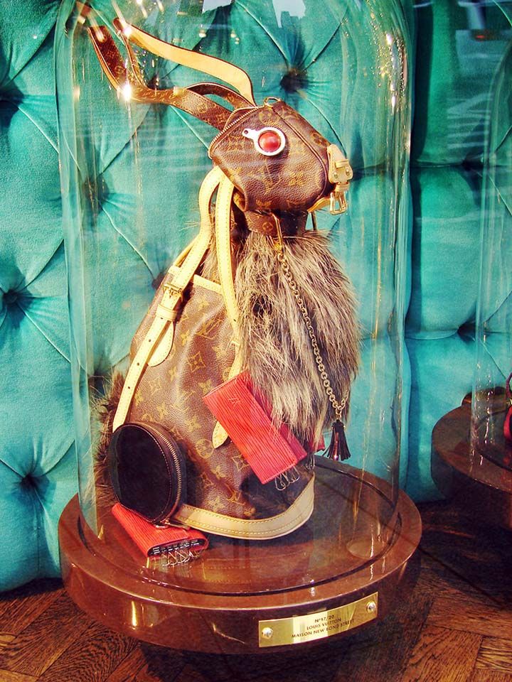
For the next part of my summative brief project, I have been asked to analyse two examples of retail environment which feature fur. So this could be a window display, in-store interiors or an example of point of sale. As I began my research, pinning to my Pinterest board which I am currently working on throughout this project (I will link below), I was surprised at the lack of retail environment examples to feature fur. Below are some examples I came across whilst researching into fur within visual merchandise for this task, the two images at the end of this post, the window display for Louis Vuitton and the window display for Fendi are the two images I have chosen to analyse. I selected these two examples to compare as they displayed fur in different forms, Louis Vuitton used fur in its original form, an animal whereas Fendi used fur in an impractical, creative manner, in the form of lightbulbs.
My summative brief project is now underway and for the first task, I have been asked to compare two adverts from different market levels that feature my chosen topic, fur. I kickstarted this task by collecting together ads featuring fur from a range of market levels. I found selecting the two final ads I wished to compare difficult as during my research I had come across so many I liked and found interesting. Below are some of the adverts I considered when I came to decide which two to compare for this task. The final images I have selected are the last two adverts of this post, Versace (Fall/Winter 2015/16) as my couture example and Topshop (Holiday Campaign 2014) as my mass market brand. I chose these two ads as I felt they had similarities but also differences regarding semiotic visual codes, messages, key themes, presentation and narrative, meaning that they would be interesting to compare and write about.
Drop your contour palettes, it's all about illuminating highlighter. The Kim K inspired chiseled look is being traded in for a softer, more natural, dewy finish. 'It's about using reflection on high points of the face that catch the light to create brighter, spot lit areas' clarifies Alex Box, make up artist and creative director of Illamasqua. People are really embracing this trend which could be because although perfecting that strobing technique can be challenging, it's refreshing not to be stressing about that shiny face look we have now learnt to love, particularly for those with oily skin.
strobing shares all the awesome principles (to slim and enhance your best angles) but instead of caking on the dark, shadowy make-up, strobing uses light to cheat definition. Make-Up Artist and Creative Director of Illamasqua, Alex Box, explains, “It’s about using reflection on high points of the face that catch the light to create brighter, spot-lit areas,” these highlights will enhance your angles, similarly to contouring – minus the heavy make-up.
Read more at http://www.look.co.uk/beauty/strobing-the-next-big-make-up-trend#GGV5f0R0SGBBAfzP.99
I'm all for this luminous look and it seems many others are too, strobing has taken social media by storm not only through Twitter and Instagram but strobing based Youtube tutorials have racked up hundreds of thousands of views. As you can imagine this craze has created a considerable amount of success for the make up industry and according to retail analysts, NDP Group, sales of illuminating highlighter which is used to create strobing had risen by a huge 48.5% in the first 8 months of this year. 'Make up is really driving growth in the prestige beauty market fuelled by the popularity of the selfie' explains NPD's director of beauty for the UK.
Kim Kardashian has become somewhat of a make-up icon, and unsurprisingly she too is a lover of the strobing trend. You can even learn from the make up master how to strobe like a pro by watching her step-by-step how-to tutorial which she has posted on her website (I will leave the link at the end of this post).
Strobing is officially the new buzzword in beauty and Kim Kardashian West has jumped straight on the trend, by uploading a step-by-step how-to video onto the her website KimKardashianWest.com. Ever wondered how the Kardashian get that hyper-real glow? Well now you can find out...
Read more at http://www.look.co.uk/beauty/strobing-the-next-big-make-up-trend#b07Fxw3J5pmzClzt.99
My highlighters are by far my favourite products in my make up bag, so if you haven't attempted the strobing technique yet, or you haven't found the perfect illuminating highlighter to give you that gorgeous glow I have three products I would highly recommend! Copacabana - Illuminator - Nars (£23), this is perfect if you're looking for a light glow, I even use it as a base to go underneath a powder based highlighter. Streak - Naked Flushed - Urban Decay (£22.50), this gives a really bright shine with a slight pink tone which I love and also comes in a palette along with a fabulous blusher and bronzer which is handy. Soft and Gentle - Mineralize Skinfinish - Mac which gives a really dewy golden glow, this works a treat over the top of Copacabana by Nars (my favourite combination to date!)
I have to say I think that this current obsession with strobing within make up is part of a bigger trend, at the moment we all seem to love all things shiny and glittery! maybe an idea for another blog post.. so keep your eyes peeled.
Last week I received my first summative brief- eek. The brief entails producing a brand / retail promotion and visual analysis report. I was asked to select the subject matter I would take on within this project from one of the trends I focused on during the group formative project (Menswear Outerwear A/W 2015/16 Trend project). Being the sucker for fur I am, I was immediately drawn to the 'Fur' category I had previously looked into.
My work will be presented as an A4 printed illustrated report made up of 2,500 words on a minimum of 16 pages. The report will be split up into 3 stages:
Fashion Communication - Brand and retail promotion analysis
Cultural Communication - Visual, historical and cultural analysis
Your Communication - Context analysis, idea and concept
I have kickstarted my research the way I usually do, a Pinterest board where I have been collating images featuring fur to help me begin to generate thoughts and ideas. Below are some of my favourite images from the board so far.
I will be keeping my blog updated with each step of this brief as I work through it and I will also link the Pinterest board I keep adding to as I continue to pursue this brief below, so if any of this has sounded remotely interesting or you just have the same love fur that I do, please feel free to keep checking up on my blog and Pinterest account!
It was the gorgeous Leona Lewis' appearance on Sundays final of the X Factor which drew my attention to this current hair trend. It seems that glitter is the new chalk. I'm in love with this trend, I love how it is girly yet so fun and outrageous. This trend spiralled from the idea of covering up those dreaded roots, as girls began to paint their partings with glitter. The trend has now escalated and we are beginning to see many more glitter/shiny based hairstyles such as glitter streaks, full metallic scalps, glitter dip dye and even hair tattoos! I feel that over the festive period this trend will continue to grow more and more popular, glittery hair has to be the ultimate Christmas hairstyle if ever there was one right? Definitely something I plan to try out for my work Christmas party, after all if you can't get away with glittery hair at a Christmas party, when can you get away with it?
Leona Lewis
Leona Isn't alone, there has been a whole host of celebrities who have sported the moonshine hair trend in some form or another including Beyoncé, Rita Ora, Miley Cyrus (an absolute sucker for this trend) and Kylie Jenner. I really like Kylie's adaptation of this trend, she opted for a gold hair tattoo. The hair tattoo, possibly a lovechild produced from the glitter hair trend and the metallic tattoo trend perhaps, has become a trend in itself. Which could be partially down to a certain hair Queen posting the below picture on her Instagram account.
Kyle Jenner
I couldn't decide on just a few images of the moonshine hair trend to show you, so I thought I would share some of my favourite examples below! One thing that's really great about this trend is that it doesn't rule out brunettes! So many hair trends we've seen in the past have only catered for myself and my fellow blondes such as hair chalk and coloured hair spray. However this trend suits darker hair as well as working for blondes, particularly the hair tattoo, dark hair really makes them pop. My favourite interpretations of the moonshine hair trend have to be the messy, imperfect ones rather than the defined streak of glitter down the parting (in my opinion this has been overdone now). I really like the metallic scalp look which features within the below collage (far right, one from the bottom), however I do feel that this adaptation will probably be one that doesn't translate so well from the catwalk. Where glittery roots are quite easy to produce and relatively wearable (kind of) a metallic golden scalp maybe a little over the top for your average day.
Moonshine Hair
This trend has not only featured on our Instagram feeds but also the catwalk. Ashish has brought the moonshine hair trend to the runway on two occasions, firstly for their S/S15 RTW collection and also their S/S16 RTW collection. Although both catwalks have featured this hair trend, it was executed very differently in each. The 2015 collection was much more metallic strand based and the 2016 collection was predominantly sequin based. Below are images from the Ashish S/S16 RTW collection. The use of the moonshine hair trend within this collection suggests that it will stick around for a while, so is likely to be a trend we will see a lot over over next Summers festival season.
Ashish S/S 2016
So get your out your glitter girly girls, and keep an eye out for this trend during all your festivities during the Christmas period! I created a Pinterest board dedicated to this trend, so feel free to follow this link to check it out; https://uk.pinterest.com/ichriston/the-glitter-hair-trend/
Love, Isabella x
Photo Credits: Google images, Pinterest, Zoe London - Lifestyle Blog
It seems the fashion industry is seeing thinner and thinner models each year, which quite frankly has been doing society no favours. With role models such as Kate Moss uttering words that can only shatter self esteem levels to a groundbreaking low, 'Nothing tastes as good as skinny feels' I ask myself just how much thinner can we get?
As designers continue to create unreasonably small sample sizes, the 'Paris thin' look is becoming more and more prominent on our catwalks, as models must have an incredibly slight, size zero frame to even fit into the clothes in the first place. On from this when magazines shoot, featuring garments from the catwalk collections, they too can only hire models who can get into the clothes, which only means this vicious circle continues.
But It isn't just the 'Paris thin' models that are contributing to the eating disorders, body image anxiety and depression we are seeing more and more of within society. We are set unrealistic and unachievable expectations through the use of photoshop. During the week we are exposed to 5000 photo-shopped images and with 90% of British women suffering with body image anxiety, it's unsurprising that research has shown that the 'airbrushing culture' leads to self esteem issues. Due to this deceiving use of airbrush, I feel that young girls have absolutely no hope of feeling comfortable in their own skin. How can they? They are comparing themselves to something which is completely unrealistic, because in reality these models don't look how they do post photoshop so the young women of society can't expect to either.
Eating disorders have doubled over the past 15 years and depression in women has doubled between 2000 and 2010. These statistics suggest that the desire to look 'perfect' is taking a horrifying toll on society. However many high profile stars are beginning to fight back to photoshop including, Lady Gaga, Ashley Benson, Keira Knightley and Beyoncé. To the right is an image from H&M's 2013 swimwear campaign in which Beyoncé featured. The singer was incredibly offended when she discovered that H&M had altered her image to which she immediately fought back, refusing to allow the fast fashion brand to airbrush the images. The images were later released without airbrushing which I think sends a great message out to the young girls of society. After all Beyoncé is know for her beautiful curves, why should they be airbrushed?
Many young women are too self conscious that they don't even feel comfortable exercising, I think that these insecurities are heavily influenced by social media. It seems everyones lives are occupied with taking the perfect selfie and stalking gorgeous Australian blondes with the perfect pearly white smile and a dirty tan (we all do it girls). This social media obsession is clearly having an affect on our self esteem levels and with our appearance being graded by the amount of likes our selfies get, is there any wonder? This desire to look 'perfect' on social media is becoming increasingly out of control, so much so that now many are editing the photos they post on sites such as Instagram and Facebook.
You have probably began to notice the 'plus size model' trend that has become prominent within the fashion industry over the past few years. We are now seeing curvier women on catwalks and many more plus size clothing ranges and brands. The gap in the market for plus size has been spotted by mass market fashion brands who are now using plus size models within campaigns, advertising and dedicating whole plus size ranges to the curvier woman. High street brands who now offer a plus size range include Misguided, Forever 21 and H&M. Plus size models are becoming much more high profile than they have been before. Katya Zharkova is the first plus size model to appear in Cosmopolitan Russia and has worked with labels including Forever 21 and Silver Jeans. She supports the idea that we have right to live healthily but without the pressure to obey society’s standards when it comes to beauty and image.
I hope that this post has made you a little more aware of the process images go through to create 'perfection' these days, so remember to bear that in mind next time you have the urge to compare yourself with an airbrushed model!
This has to be my favourite shoe trend of the season, I just love these boots and according to my Instagram feed I'm not alone on that one! It's Raf Simons we have to thank for the calf skin patent ankle boots pictured below. These boots, which in my opinion instigated this seasons patent boot trend strutted down the Christian Dior Fall 2015 RTW catwalk accompanied by a suitable soundtrack 'Hot on The Heels of Love' back in March, and ever since then we have seen this trend spread like wildfire across the High Street.
Priced at £1100, many of us have been flocking to High Street brands for a cheaper alternative and It's unsurprising that Zara, the Queen of catwalk steals provided us with a creditable replica. You had to be quick if you wanted to bag Zara's affordable version of the boot, priced at a considerably lower £69.99, as they flew off of the shelves almost immediately leaving many (including myself) feeling disappointed. If you're still desperate to make a pair of these Zara boots the newest addition to your winter wardrobe they are currently available on eBay, but at an inflated price of course (around £86). Although many High Street brands such as Topshop, River Island and Kurt Geiger have showcased Christian Dior like boots in their stores this season, I feel that Zara's adaptation of the trend has been the most similar to the original Christian Dior boots. Although the patent ankle boot has been prominent across High Street brands this season, the patent boot accompanied by the lucite heel has not translated from the catwalk so well and therefore is much more rare. I think that it is the lucite heel feature of the Zara boot, taken from the original Dior designs which has made them so popular and well received as this is what makes the boots so unusual and therefore appealing, because lets face it we've all seen a patent boot before!
I find it really interesting that it has been specifically the patent ankle boot that has really taken the fashion world by storm this A/W as the Christian Dior Fall 2015 RTW collection also featured thigh high versions of the boots however it seems that these have not translated so well onto the High Street. I think that this is probably due to the wearability of the boots, as the ankle boots are much more wearable for High Street shoppers. As much as I love the thigh high versions I don't think I'll be rocking up to uni in them any time soon!
This week saw my group searching the streets of Nottingham for individuals who were dressed in our chosen trends to photograph. We then presented our images during yesterdays seminar and discussed how we felt the trends had been translated onto the streets compared to what we had found in our initial research task and retail task. Just to remind you, the mens outerwear trends my group are looking into are as follows.
Styles - Bomber Jacket, Duster Coat, Parka
Colours - Camel, Black
Materials - Fur, Quilting
The street style task within this project was the activity I had been looking forward to the most and it definitely lived up to my expectations. My group got off to a slightly rocky start as we had underestimated how difficult it was to catch the attention of those we wished to photograph, but once we got going we had much more confidence!
Below are my two favourite images from the street style task, which interestingly were the first two images I took. This particular example of outerwear fell into our 'Fur' category. This guy was so comfortable and relaxed with being photographed, which I feel contributed to the success of these images, as they are not at all awkward or forced. My group soon found that the images we took of those who were slightly uncomfortable with being photographed, were the least successful.
If only I had a pound for every time I heard 'Does this mean I'm fashionable then?'...
After having spent a few days on the streets of central Nottingham searching for our chosen outerwear trends and taking photographs of those sporting these trends, my group and I began to create the presentation we presented to the rest our seminar group and a couple of our lecturers yesterday. As we looked back through the images we had taken throughout the beginning of this week, it became clear which of our chosen trends had filtered down and been adopted by the consumer and which trends people hadn't taken to so well. Our street style task supported some of our initial predictions but also went against some. We found that the duster coat was not as popular as we originally anticipated. However I came to the conclusion that this particular coat is likely to be a popular choice of outerwear amongst business men, who would obviously be at work on a Monday and Tuesday rather than out on Nottingham's High Street, which could explain why we saw just one example of the duster coat. My group were surprised at the lack of camel coloured outerwear we came across during the street style task. During last weeks retail analysis task, we saw a huge amount of camel coloured outerwear, so clearly this is a colour trend that isn't translating so well from retail to consumer.
My group and I found it really interesting at how the different areas we visited in Nottingham affected the trends we came across. For example when visiting the Hockley area of Nottingham, we saw many sporting the the bomber jacket and the one duster coat we came across we photographed just off of Bridlesmith Gate, where many of Nottingham's higher end stores are located.
I really enjoyed this street style task so hopefully street style photography will be something I have the opportunity to do again! If street style is something that interests you, I recently watched a really inspiring and insightful film which may be of interest based on the professional life of Bill Cunningham, a street style photographer from New York, I will link the trailer below.
Following on from my last blog post 'Factors Of Identity - Tiffany & Co.' I thought I would select a brand, which wasn't touched upon within the 'Factors Of Identity' lecture last week to look into regarding factors of identity. I decided to focus on another of my favourite brands, the lovely Kurt Geiger. Okay so I may be a little biased towards the company as I work for Kurt Geiger myself, but I thought that I could use some of the knowledge I have learnt from working within the business to understand the brands factors of identity that little bit better.
Kurt Geiger doesn't have a logo as such, but similar to Tiffany & Co., the brand name currently takes on the role of a logo. The name stands as an umbrella brand for each of the individual brands within the company such as Miss KG, Carvela and Kurt Geiger London. The fact that Kurt Geiger doesn't have a logo could possibly be down to the fact that one logo wouldn't be appropriate for each of the individual brands within the company. For example a logo which would be suitable for Miss KG, the most affordable brand within the company which is directed at a slightly younger target market would not be fitting for Kurt Geiger London, the company's highest end brand which is directed at a much more affluent and subsequently older target market. Although the company does't have a logo, they do have a slogan, a factor of identity many brands tend to lack. The slogan 'Anything but the dress', is a term I feel is suitably fitting for the company as it addresses the fact that Kurt Geiger is an accessory brand.
Bright red is Kurt Geiger's key colour which is evident in each of their stores, their website and their packaging. This shade of red has positive connotations such as love, passion and desire but also negative connotations such as danger and anger. However these negative connotations could actually refer to less severe ideas such as strength and power, attributes a woman may feel when trying on a new pair of stilettos perhaps.
I must admit I have a slight obsession with Kurt Geiger's gorgeous glossy carrier bags, I thought that the novelty would wear off when I started working for the company but 6 months down the line I can confirm, it hasn't. They are always so perfect the red ribbon neatly securing your purchase, suggesting luxury and exclusivity. I soon found out after joining the company that there is a very specific way of creating that KG bow!
In 2009, Kurt Geiger introduced the stiletto as a brand signature style. The stiletto, undoubtably a product which is a true reflection of the brand itself connoting glamour, sex appeal, power and elegance has been the brands key style ever since. Kurt Geiger even have a video on their website which follows the creation of their famous Britton stiletto (I will link below). The Britton shoe, which is priced on average at around £200 takes centre stage within many Kurt Geiger stores within their signature shoe chandelier (I will link a shoe chandelier video below also). Right is an illustration of a pair of Britton stilettos by Jackie Bisset.
The Geographical reference for Kurt Geiger is London, where the Company's headquarters are located. The business originally opened its doors in 1963 on Bond Street, hence why one of the brands most popular, famous stilettos is named 'bond'. The Kurt Geiger website often refers back to its geographical reference, Englands capital. The website reads 'Kurt Geiger has set itself apart with fashion authority blending London style and urban wearability.' and 'London styling is at the heart of the Kurt Geiger brand.' Some may even argue that the the brands Geographical reference is carried throughout each aspect of the brand through the use of its key colour key colour, red. Red is a colour I feel has strong links with the City of London. The Kurt Geiger red is similar to that of the red found within the British flag, postboxes, telephone boxes and buses.
Kurt Geiger's cultural reference is the face of the brand herself, the gorgeous, Lara Stone. The British models edgy, individual look partners her perfectly with the brand. The Autumn/Winter 2015 campaign she recently starred in saw her pose for several shots one dressed in nothing but bags another wearing velvet thigh high boots and another wearing stockings and a suspender belt. 'It's about strength and sensuality, and being comfortable in your own skin' explains Rebecca Farrar-Hockley (Kurt Geiger's Creative Director) regarding the campaign video, which was created to evoke 'power and strength'. I love Lara Stone and think she is a fabulous representation of the brand, something tells me I'm not the only one, as this is the second time she has been cast to star in a Kurt Geiger campaign! The A/W 2015 campaign video which I have posted below is worth a watch, isn't she fab?
Overall I think that Kurt Geiger have built up a strong brand identity, however a factor of identity which Kurt Geiger lack is a pattern. Similar to Tiffany & Co., Kurt Geiger is a relatively sleek, smart brand and I feel a pattern would not effectively reflect these qualities. The simplistic use of the red tone is sufficient in creating a significant brand image for Kurt Geiger, therefore in my opinion a pattern is unnecessary.
Last week, Tuesdays lecture focused on factors of identity within brands. This basically involves everything that makes a brand what it is, what it stands for and what makes it memorable and recognisable. Certain brands build up an identity really well, others not so well. Factors which a brand may use to make up an identity include a logo/crest, colour/tone, pattern/motif, a key product, a gesture/message and geographical and cultural references. Within the lecture, we looked at how a range of brands including Tiffany & Co., Liberty, Burberry and Hermes have chosen to use these aspects to build up their brand identity.
Tiffany & Co. has to be one of my favourite brands which is made quite evident looking at my christmas list! The brand is incredibly recognisable, I would even say one of the most recognisable brands out there, so it was really interesting to have an insight into just what makes it so identifiable. To begin with I think the name of the brand, particularly the use of the word 'Co' really influences its reputation of status, exclusivity, prestige and luxury which gives the consumer a desire to own.
It's utterly undoubtable that Tiffany own that particular shade of blue. This turquoise blue has become so representative of the brand that it is even often referred to as 'Tiffany blue' (I'm definitely guilty of doing this). You only have to see something in this blue tone to immediately think of the luxurious jewellery brand. This colour is so cool, crisp, classic and luxurious which is really reflective of the brands products and the brand itself.
'The best presents come in a small blue box'. So girls, who doesn't have a collection of these gorgeous boxes on their dressing table? This packaging has become so recognisable that it doesn't have to have the brand name displayed anywhere on it but you just know what you'll find inside, because the box has become signature of the brand.
Tiffany's key product the ring, to me is a true reflection of the glamour, heritage and sophistication associated with this admired brand. This product has such strong links with romance, desire and taste which are all true concepts to Tiffany & Co. as a brand.
New York is the Geographical reference for Tiffany and Co., its flagship store (right) is located here. The store, based on the corner of Fifth Avenue and 57th Street was opened in 1940 on October 21st. I've never been to this store but it just looks truly magical! I can't wait to make a visit when I travel to NYC in January and treat myself to something from my Tiffany wish list! Regarding its flagship store on 5th Avenue a quote on Tiffany's website reads 'It is simply the most famous store there is. Every cab driver, every New Yorker, every visitor knows where to find Tiffany & Co. This is the marvellous place where dreams come true'. The links the brand has with New York gives it this essence of glamour and style we associate with Tiffany & Co..
Tiffany's cultural reference is the stunning Breakfast At Tiffany's star Audrey Hepburn. The image of Hepburn on the right just shouts Tiffany's, from the elegant, glamorous lady herself, to the statement jewels and the blue background. The image portrays the true confidence, exclusivity and sophistication of the brand.
Taking into account all of these factors which together make up the identity of Tiffany and Co, I think the company has done a really great job at defining itself as a brand and I would definitely say it has to be one of the most well identified brands, if not the best of all. Out of all of the aspects we looked at in the lecture which make up a brands identity, Tiffany and Co. only lacked one, and that was pattern/motif. I have to say I think this is intended, the simple, timeless and classic blue and white box is used to reflect the sophistication of the brand and this is all that is needed. I think a pattern would not at all work effectively with this brand as it would be too fussy which I think would lead to Tiffany & Co. maybe losing some of this well earned brand identity and also the luxury of it, as it is known for being smart, and simple rather than over elaborate. I also believe that a motif would be unnecessary for Tiffany's also, the name 'Tiffany & Co.' and the typography of this is recognisable and in my opinion the simplicity of this adds to the luxurious feel of the brand.
Below is Tiffany's most recent ad 'A Tiffany Holiday'. The Christmas advertisement oozes all the brand stands for and a number of factors which contribute towards this brands identity are captured within this ad, from the setting of New York to the use of the brands statement colour, which together create the feel of romance, sophistication and glamour. I really like how the identity of Tiffany's is made so clear within this ad, giving the same sense of luxury and desire you would expect if you were to visit a Tiffany and Co. store itself.
Hopefully this post may have explained a little bit more about why we see that shade of blue or that pretty packaging and immediately think 'Tiffany & Co.'.
Love, Isabella x
Photo Credits: Google images, Tiffany.com, Youtube